Every logo will at some point need a revamp. There’s no shame in it. After all, times move fast. Just look at Google – they released a new logo in September 2015, it’s 7th since 1997.
Acting quickly to reshape and tweak your company logo isn’t just admirable – it’s necessary in order to keep up. But sometimes, redesigns can take an ugly turn. And even the biggest companies in the world have made blunders. Here are five cases where the new logo was definitely a no-no.
1. GAP

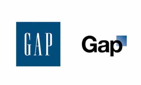
Let’s start with a particularly infamous case – GAP. This multinational clothing retail company had the world at their feet in the noughties. Now you can’t go anywhere on the internet without seeing a story about their botched logo redesign.
Whilst mixing up their logo appeared to be an odd decision, the design that the bigwigs at GAP actually selected proved to be even more peculiar. Moving away from their classic big blue box with “GAP” written boldly in the centre, the redesign shrunk the blue box and stuffed it behind the top-right-hand-corner of the letter “P”. The font changed to black, and the last two letters were relegated from capital letters to lower case.
The new design lacked any kind of power or conviction, and was met with a hostile response on social media. The logo was ultimately scrapped just days after it was released.
2. London 2012

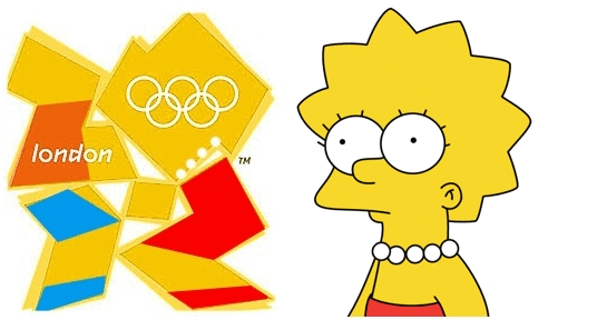
Another classic case of a bad redesign that was met with a fierce critical backlash was a biggie – The London 2012 Olympics logo. Strange and stilted enough to cause a headache, this design had people squinting their eyes and scratching their heads from the moment it was beamed out to the world. A lot of people even claimed that the logo looked like cartoon character Lisa Simpson committing an inexplicable act. And once you see something as wrong as that, you can never unsee it. Shudder.
3. Yahoo!
With the first two examples, you can see that the designers were trying to take the brand in a new direction. The logo redesign for Yahoo was so conservative and lacking in inspiration that it was barely worth doing. The original logo was simply the word “Yahoo!” in purple, capital letters. The new logo was also the word “Yahoo!” in purple, capital letters. The only difference was that the shade of the font changed and the letters were given a bit of a “funkier” edge (differing in size and shape).
Nobody was particularly impressed when the redesign for this search engine was announced, and it’s painfully easy to see why – especially given how much they’d raved about it in the build-up.
4. Animal Planet

The less said about Animal Planet’s redesign, the better. There was nothing wrong with the TV channel’s original logo, but they went ahead and changed it to something almost illegible anyway. The letters varied in size and colour, and the “M” in “Animal” was even flipped over so it resembled a weird, giant number 3. A bizarre rebrand in every sense of the phrase.
5. IHOP

This American restaurant chain had a nice simple logo in use before their rebrand – an inoffensive, friendly and recognisable design. Their brand new logo looks fine on first glance … but then your eyes wander over to the last two letters, where a curved line sits below them. The “O” and the “P” represent two eyes, with the curved line underneath taking the shape of a smile. It’s supposed to look like a friendly face, but the choice of colouring and font actually makes it look like a wide-eyed clown staring back at you. Not really the best advert for a family restaurant. In fact, it’s rather creepy.
Rebrand with a winning logo
Are you rebranding? Do you need a fresh and exciting new logo? Our logo-design team is here to help. Bing Digital will stop at nothing to discover every last detail that makes you you! For more information, take a look at our logo design services or contacts us today. We’re looking forward to hearing from you.
