As mobile shopping continues to grow, ensuring that your Shopify store is mobile-friendly is essential for success. Many customers now use their handheld devices for online shopping, so creating a seamless user experience on mobile can significantly boost your sales. By implementing effective mobile optimisation tips, you can enhance navigation, speed, and overall satisfaction for your customers.
Your Shopify store should not just function on mobile but thrive. Optimising your site means focusing on faster load times and easy-to-access features that meet the unique needs of mobile users. Simple adjustments, like call-to-action buttons that are easy to tap, can make a big difference in user engagement.
In this blog post, you will learn practical strategies to maximise mobile shopping experiences through Shopify. From design tweaks to performance enhancements, these tips will help you create a better shopping journey for your users and ultimately lead to increased conversions.
Fundamentals of Shopify Mobile Optimisation
Mobile optimisation is vital for any Shopify store aiming to enhance customer satisfaction and increase sales. Understanding how mobile users interact with your site, the necessity of a mobile-friendly design, and how to leverage responsive themes are key aspects of creating a successful mobile shopping experience.
Understanding Mobile User Behaviour
To optimise your Shopify store for mobile, it’s essential to grasp mobile user behaviour. Mobile users often seek speed and convenience. They want fast-loading pages and easy navigation. According to studies, most users abandon sites that take longer than three seconds to load.
Focus on what users need when shopping on their phones. They typically value:
- Quick access to product information
- Simplified checkout processes
- Responsive design that adapts to different screens
Understanding these preferences can help you tailor your store to meet their needs effectively.
Importance of a Mobile-Friendly Store
Creating a mobile-friendly store is crucial for retaining customers. A mobile-optimised site enhances the overall mobile user experience. If your store is challenging to navigate, users are likely to leave, resulting in lost sales.
Key benefits of a mobile-friendly store include:
- Increased engagement: Users are more likely to browse and make purchases.
- Higher conversion rates: Smooth navigation can boost sales.
- SEO advantages: Search engines prioritise mobile-friendly sites in rankings.
By ensuring your store is mobile-friendly, you can significantly enhance user satisfaction and loyalty.
Leveraging Shopify Themes for Mobile Design
Shopify offers various responsive themes designed for mobile optimisation. Selecting the right theme is the first step in creating a seamless mobile experience. Look for themes that automatically adjust to different screen sizes.
Key features to consider when choosing Shopify themes include:
- Speed: Themes should load quickly to keep users engaged.
- User-friendliness: Intuitive layouts make navigation easier.
- Customisation options: Allow for personalised branding and functionality.
By leveraging these themes, you can create an appealing, efficient site that caters to mobile users’ needs.
Enhancing Mobile User Experience and Functionality
Improving the mobile user experience is crucial for engaging customers and increasing conversion rates. Focus on layout and navigation, key page elements that drive conversions, and performance factors such as load times. Each element plays a significant role in how users interact with your Shopify store on mobile devices.
Optimising Layout and Navigation
A well-structured layout and intuitive navigation are essential for guiding users through your store. Use sticky navigation to keep important menu options visible as users scroll. This feature allows quick access to different categories without losing their place.
Ensure that your layout is responsive. This means it should adapt seamlessly to various screen sizes without layout shifts. A stable design minimises distractions and helps users find what they need faster. Keep menus simple and prioritise the most important links.
Consider using large, touch-friendly buttons for navigation. These buttons should be easy to click and spaced apart to prevent accidental taps. A good rule is to use a maximum of five main menu items to avoid overwhelming users.
Page Elements That Drive Conversion
Key page elements can significantly impact your site's ability to convert visitors into customers. Make sure your call-to-action (CTA) buttons stand out. Use contrasting colours and clear language to encourage users to take action, such as "Buy Now" or "Add to Cart."
Incorporate high-quality images and concise product descriptions. These help users make informed purchasing decisions. Additionally, eliminate unnecessary elements on product pages to keep the focus on what matters most.
User reviews are another powerful tool. Displaying ratings and testimonials can enhance trust and influence buying choices. Consider integrating a simple star rating system that’s easy to spot.
Improving Load Times and Performance
Load times can make or break user experience. Optimising your Shopify store’s page load speed is crucial. Aim for a load time of under three seconds. You can achieve this by compressing images and minimising the use of heavy scripts.
Utilise tools like Google PageSpeed Insights to identify areas for improvement. Implement recommendations such as leveraging browser caching and reducing server response times.
Regularly test your site’s performance on different mobile devices. This practice helps ensure a consistent experience across platforms. Fast-loading pages not only improve user experience but also contribute to higher conversion rates.
Optimising Visual Elements for Mobile Shoppers
Optimising visual elements for mobile shoppers is crucial for enhancing user experience. Two main areas to focus on are responsive images and the colour scheme and typography. Making these adjustments ensures your Shopify store is visually appealing and easy to navigate on smaller screens.
Responsive Images and Image Optimisation
When you use images on your Shopify site, they need to be responsive. This means they should adjust automatically to fit different screen sizes. High-quality photos attract customers, but they must load quickly to avoid losing interest.
You can optimise images by following these steps:
- Use appropriate file formats: JPEGs work well for photos, while PNGs are better for graphics with fewer colours.
- Compress images: Tools like TinyPNG or ImageOptim can reduce file size without sacrificing quality.
- Serve images in different sizes: Use responsive images by providing multiple variations so browsers can choose the best one for the user's device.
By keeping your images optimised, you can significantly improve loading times and user satisfaction.
Fine-Tuning the Colour Scheme and Typography
Your colour scheme and typography play a vital role in mobile design. A well-chosen palette and easy-to-read fonts help guide users through your site.
Here are some tips for enhancing these visual elements:
- Select contrasting colours: This improves visibility and makes text stand out against backgrounds. For example, use dark text on light backgrounds or vice versa.
- Choose appropriate fonts: Use sans-serif fonts for better legibility on small screens. Keep font sizes large enough, ideally 16px or bigger, for easy reading.
- Limit font styles: Stick to two or three complementary font styles to maintain a clean and professional look.
By carefully selecting colours and fonts, you can create an engaging mobile experience for your shoppers.
Maximising Performance and Enhancing SEO
To enhance your mobile shopping experience, focus on performance and SEO optimisation. These elements directly influence how customers interact with your site and how search engines rank it.
Speed and Performance Optimisation
Fast loading times are crucial for mobile users. Use tools like Google PageSpeed Insights to analyse your site's speed. Aim for a load time of under three seconds to keep visitors engaged.
Consider Lazy Loading to improve load times. This technique only loads images and content as users scroll down the page. It reduces initial load time, providing a smoother experience.
Utilise a Content Delivery Network (CDN) to distribute your content across various servers. This ensures quicker access for users no matter where they are located.
Also, review your settings in the Shopify Admin to ensure optimal performance. You can minimise image sizes and reduce heavy scripts that slow down your site.
SEO and Mobile-First Indexing Considerations
With mobile-first indexing, Google prioritises mobile versions of websites for ranking. Ensure your site is mobile-friendly and easy to navigate.
Use Google Search Console to monitor your site's mobile usability. Address any issues, such as broken links or content that does not display well on smaller screens.
Structure your content using headers and short paragraphs to improve readability. This format helps both users and search engines understand your information easily.
Additionally, optimising your website’s metadata is vital. Use relevant keywords related to your products to improve your SEO rankings. This can significantly impact your online visibility and sales performance.
Frequently Asked Questions
Mobile optimisation is vital for improving user experience on your Shopify store. Below are specific questions and answers that can help you enhance mobile shopping.
What are the key elements for a mobile-friendly Shopify store design?
A mobile-friendly design includes clear navigation, readable fonts, and responsive images. Use a simple layout that allows users to find products easily. Ensure buttons are large enough for easy tapping and that the overall design is clutter-free.
How can I improve the loading speed of my mobile site on Shopify?
To improve loading speed, reduce image sizes and use compressed files. You can also minimise the use of heavy scripts that slow down performance. Enable browser caching and consider using a content delivery network (CDN) for faster content delivery.
What strategies can be implemented to enhance the mobile checkout process for customers?
Streamline the checkout by minimising form fields and using autofill options. Offer guest checkout to speed things up, and ensure all payment options are easily accessible. Providing clear calls to action will also help guide customers through the process.
How does responsive web design impact the shopping experience on mobile devices?
Responsive web design ensures your site adapts to different screen sizes. This provides a seamless shopping experience, as customers can easily navigate, view products, and complete purchases on any device. It eliminates the need for zooming or scrolling horizontally.
In what ways can I leverage Shopify's built-in tools to optimise for mobile shoppers?
Shopify offers various built-in tools such as mobile-friendly themes and apps that enhance mobile performance. Use these tools to customise the layout and improve navigation. Analytics tools also help you track mobile user behaviour to make informed decisions.
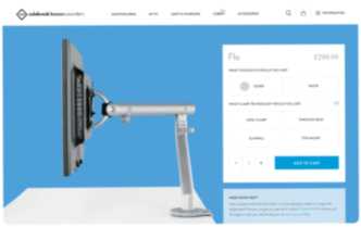
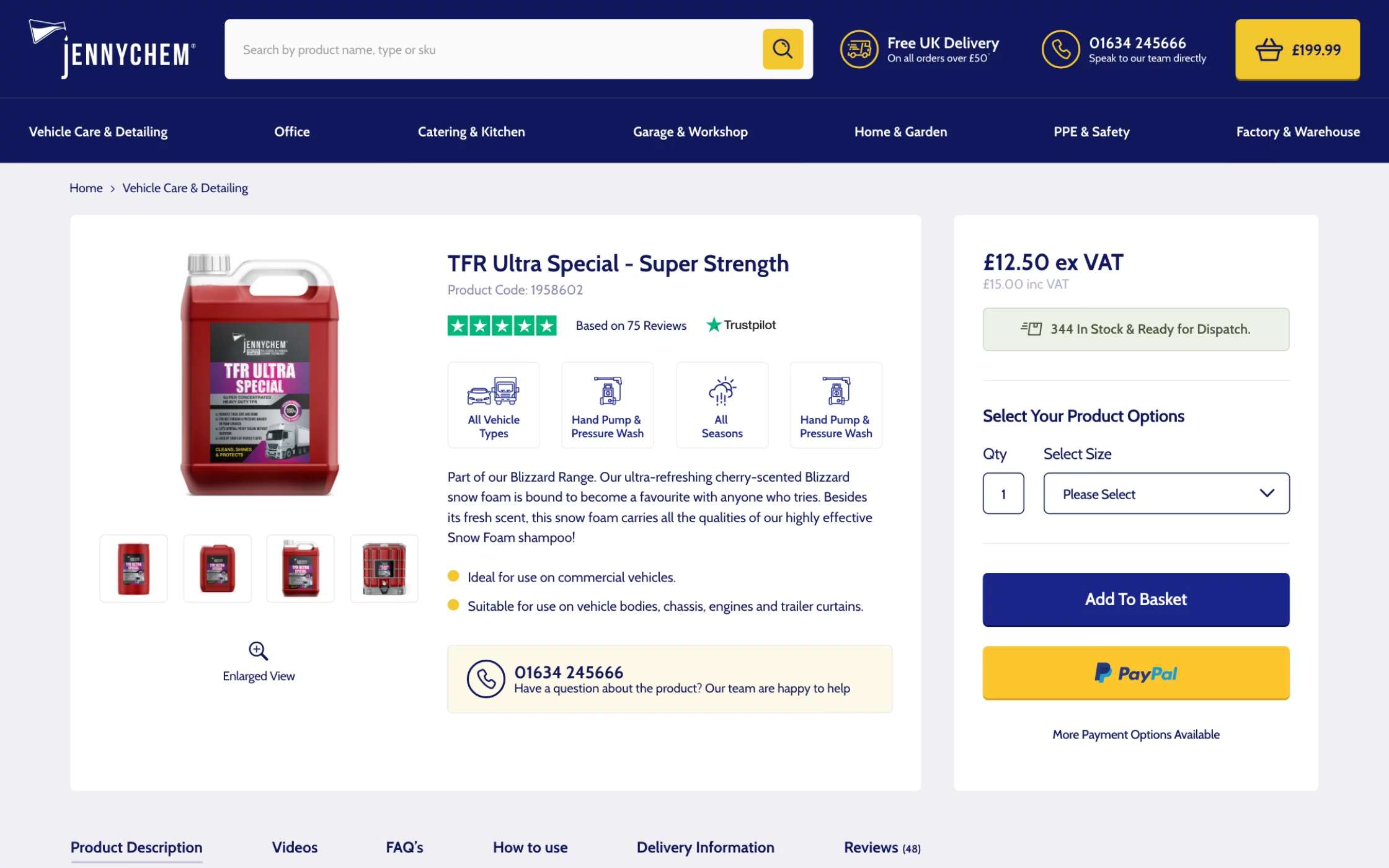
What are the best practices for creating mobile-optimised product pages on a Shopify store?
Use high-quality images and concise descriptions for your products. Ensure each page loads quickly, and include prominent ‘Add to Cart’ buttons. Highlight key information like prices and availability to make it easy for customers to make decisions.