

Most brands believe their mobile experience is fine because the tools say so. The site is responsive, it passes Google's mobile-friendly check, the Core Web Vitals are green. And yet mobile converts at a fraction of desktop, and the gap is written off as just how mobile is. It is not. That gap is revenue, and the tests you are passing were never designed to find it.
Mobile-friendly and mobile-converting are different things. One asks whether the page renders and loads acceptably. The other asks whether a distracted person, one-handed, on a train, with a thumb and three seconds of patience, can get from interest to purchase without friction. Most premium stores pass the first test comfortably and fail the second quietly.
The tests you pass measure the wrong thing
Technical mobile scores measure delivery, not experience. They tell you the page arrived quickly and did not jump around. They say nothing about whether the customer could read the price without zooming, tap the right button without missing, or complete checkout without surrendering halfway through. A store can score beautifully and still leak sales at every one of those moments.
This is why chasing a higher performance score often changes nothing on the revenue line. You optimised the thing that was already adequate and ignored the thing that was actually costing you. The score went green, the conversion rate did not move, and everyone concluded mobile is just hard.
Where premium stores actually lose the mobile sale
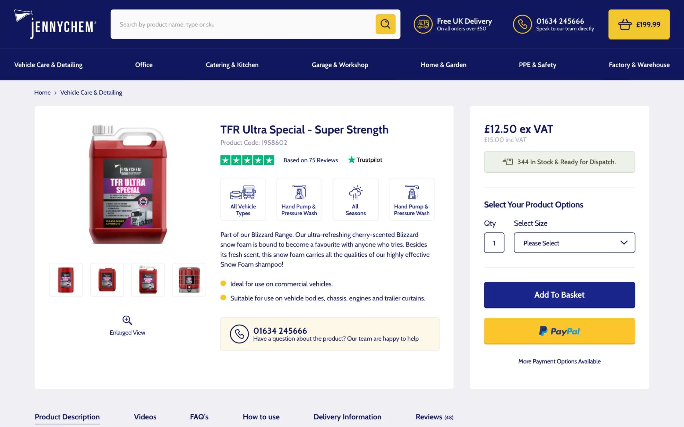
The losses cluster in a few predictable places. Checkout is the biggest: forms built for a mouse and keyboard, too many fields, no proper mobile payment options, and a layout that fights the on-screen keyboard. Then interaction friction: buttons too small or too close, menus that are awkward one-handed, filters and search that were clearly designed on a desktop and squeezed down.
Trust is the quiet one. On a small screen, the signals that reassure a buyer, the reviews, the returns policy, the security cues, often get buried below the fold or stripped out to save space. A premium brand that looks effortless on desktop can feel uncertain on mobile, and uncertainty at the point of payment is where high-value carts get abandoned.
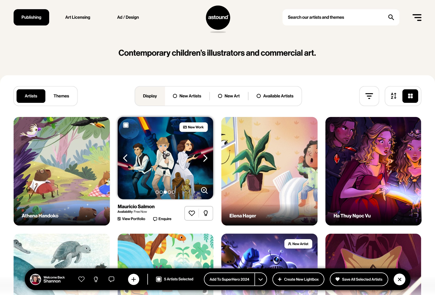
The same pattern repeats earlier, in discovery. Filtering a large catalogue, comparing options, reading the detail that justifies a premium price, all of it was designed for a wide screen and a precise pointer, then compressed onto a surface that has neither. The customer who would happily have browsed twenty products on desktop gives up after five on mobile, not because they were less interested, but because the effort outran the patience. That lost browsing is lost revenue, and it never registers as a checkout problem because it happens long before checkout.
What makes this hard to spot is that the customers who struggle rarely complain. They do not raise a support ticket about an awkward filter, they simply leave, and the session ends like any other. The damage is silent and aggregate, exactly like the friction that causes it, which is why it survives in businesses that are otherwise rigorously data-driven. You have to go looking for it deliberately, because it will never raise its hand.
Optimise for the thumb and the impatience
The fix starts by designing for the real conditions of mobile use rather than a shrunken desktop. That means a checkout built mobile-first with the right payment methods, generous tap targets, and the fewest possible steps. It means putting the reassurance a buyer needs exactly where the small screen needs it, not wherever was convenient on desktop.
It also means testing with intent rather than guesswork. Watch real sessions of people trying to buy on a phone and the friction becomes obvious in minutes. This is hypothesis-led conversion work, not cosmetic tinkering, and it is the kind of mobile experience work that lifted results for brands like Hackett London.
Speed is not the same as friction
The reason the technical scores mislead is that they conflate two different things. Speed is how fast the page is ready. Friction is how hard the customer has to work once it is. You can have a fast page that is exhausting to use, and that combination scores well and converts badly. Most brands have optimised the first and never measured the second.
Friction is cumulative and quiet. A field that demands the wrong keyboard, a button that sits under the thumb's natural reach, a step that could have been removed, a reassurance that is one scroll too far away. None of these is fatal on its own, and none shows up in a performance report. Stacked across a checkout, they are the difference between a customer who completes and one who decides to do it later on a laptop and never does.
This is why brands that obsess over their Core Web Vitals can still watch mobile underperform. They are winning a race the customer was not running. The customer was not timing the page, they were deciding whether buying was worth the effort, and the effort was the problem.
The cost of treating mobile as second
For most established brands, mobile is now the majority of traffic and a minority of revenue. That split is usually read as a fact of life. It is better read as a gap with a number attached. If mobile carries most of your visits but converts at half the desktop rate, closing even part of that gap is worth more than almost any acquisition initiative, because you have already paid to bring those people to the site.
The brands that treat mobile as the primary experience rather than a scaled-down afterthought are the ones capturing that value. They design for the phone first and let desktop inherit, because that is where their customers actually are. The rest are quietly subsidising a desktop-first experience with mobile traffic that deserved better.
There is a brand cost stacked on top of the revenue one. A customer whose first real interaction with you happens on a frustrating mobile experience forms a judgement about the whole business, fairly or not. For a premium brand charging a premium price, a clumsy phone experience quietly undercuts the positioning that every other part of the operation works to build. The phone is where most people now meet you first, and first impressions made there are the ones that stick. Getting mobile right is not only a conversion exercise, it is a brand one.
Measure mobile as its own P&L
The deeper change is to stop treating mobile as a smaller version of the desktop site and start treating it as its own channel with its own economics. Report its conversion rate, its average order value and its abandonment separately, set targets against them, and hold the experience to those numbers. Mobile is where most of your traffic already is, so a point of conversion there is worth more than almost anywhere else you could spend the effort.
If your mobile numbers lag desktop and the technical scores look fine, the problem is experience, not delivery, and it is findable. A focused CRO consultation is the quickest way to see where the mobile sale is actually being lost.